Sparse Bond Curves (NOK, SEK, Corp)#
This example will discuss curve building standards for bond markets with sparser data points than one might typically require.
Key Points
Assumes familiarity with the Dense Bond Curve Article.
Matching degrees of freedom.
Inferring shape from exogenous data.
Adding regularizers.
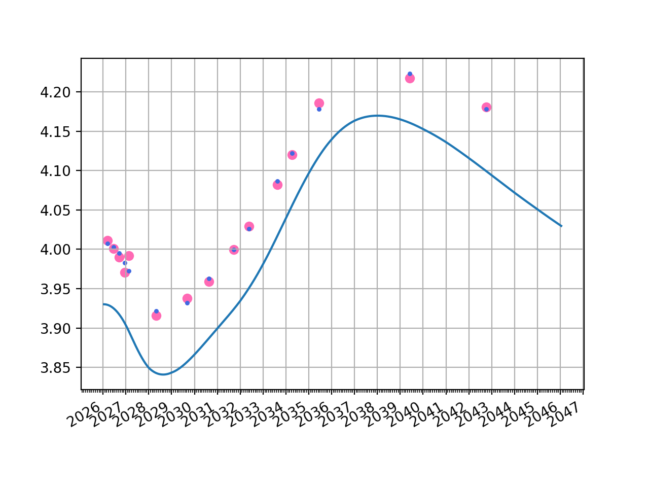
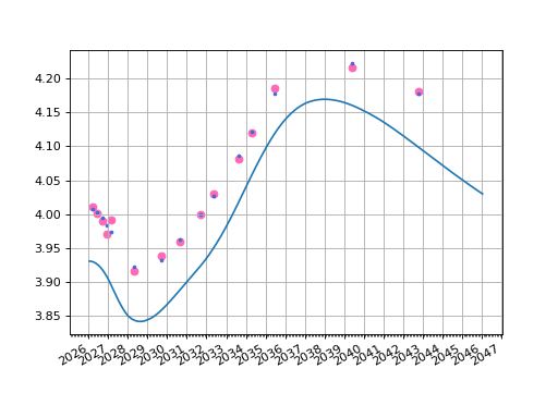
The Norwegian market actually contains a reasonable amount of bond information to construct a Curve with a reasonable number of parameters. One might even argue this is more dense, than sparse.
Below we construct a Curve with 7 degrees of freedom from 15 datapoints. The results show that the Curve is a reasonable re-pricer for the prevailing market prices.
Data
This dataset actually includes Norwegian T-Bills but the yields here are bond equivalent YTMs assuming a bond with zero coupon.
In [1]: df
Out[1]:
     Maturity  Price  Coupon
0  2026-03-18  99.39    0.00
1  2026-06-17  98.42    0.00
2  2026-09-16  97.47    0.00
3  2026-12-16  96.54    0.00
4  2027-02-17  97.68    1.75
5  2028-04-26  95.92    2.00
6  2029-09-06  92.73    1.75
7  2030-08-19  89.36    1.38
8  2031-09-17  86.31    1.25
9  2032-05-18  89.55    2.12
10 2033-08-15  93.06    3.00
11 2034-04-13  96.59    3.62
12 2035-06-12  96.66    3.75
13 2039-05-31  94.03    3.62
14 2042-10-06  91.92    3.50
As usual we can add metrics to this table, assuming that for every Instrument the current settlement period is regular from the last roll date and is not a stub.
In [2]: df["Instrument"] = [
   ...:     Bill(dt(2025, 1, 1), t, spec="no_gbb", curves="no_gb_curve", metric="ytm")
   ...:     for t in df["Maturity"][:4]
   ...: ] + [
   ...:     FixedRateBond(dt(2025, 1, 1), t, fixed_rate=c, spec="no_gb", curves="no_gb_curve", metric="ytm")
   ...:     for (t, c) in zip(df["Maturity"][4:], df["Coupon"][4:])
   ...: ]
   ...:

In [3]: df["Accrued"] = [b.accrued(settlement=dt(2026, 1, 20)) for b in df["Instrument"]]

In [4]: df["YTM"] = [b.ytm(price=p, settlement=dt(2026, 1, 20)) for (b,p) in zip(df["Instrument"], df["Price"])]

In [5]: df["Risk"] = [b.duration(ytm=y, settlement=dt(2026, 1, 20)) for (b, y) in zip(df["Instrument"], df["YTM"])]

In [6]: df
Out[6]:
     Maturity  Price  Coupon                         Instrument  Accrued  YTM  Risk
0  2026-03-18  99.39    0.00           <rl.Bill at 0x12c99e450>     0.00 4.01  0.16
1  2026-06-17  98.42    0.00           <rl.Bill at 0x12c99d650>     0.00 4.00  0.41
2  2026-09-16  97.47    0.00           <rl.Bill at 0x1157b5400>     0.00 3.99  0.65
3  2026-12-16  96.54    0.00           <rl.Bill at 0x112c3fc50>     0.00 3.97  0.90
4  2027-02-17  97.68    1.75  <rl.FixedRateBond at 0x148227230>     1.62 3.99  1.01
5  2028-04-26  95.92    2.00  <rl.FixedRateBond at 0x148226f90>     1.47 3.92  2.06
6  2029-09-06  92.73    1.75  <rl.FixedRateBond at 0x1482a4230>     0.65 3.94  3.16
7  2030-08-19  89.36    1.38  <rl.FixedRateBond at 0x1482a4470>     0.58 3.96  3.84
8  2031-09-17  86.31    1.25  <rl.FixedRateBond at 0x1482a4590>     0.43 4.00  4.55
9  2032-05-18  89.55    2.12  <rl.FixedRateBond at 0x1482a47d0>     1.44 4.03  5.13
10 2033-08-15  93.06    3.00  <rl.FixedRateBond at 0x1482a4a10>     1.30 4.08  6.13
11 2034-04-13  96.59    3.62  <rl.FixedRateBond at 0x1482a4950>     2.80 4.12  6.72
12 2035-06-12  96.66    3.75  <rl.FixedRateBond at 0x1482a4e90>     2.28 4.19  7.48
13 2039-05-31  94.03    3.62  <rl.FixedRateBond at 0x1482a5550>     2.32 4.22  9.68
14 2042-10-06  91.92    3.50  <rl.FixedRateBond at 0x1482a5730>     1.02 4.18 11.24
Curve
In [7]: today = dt(2026, 1, 16)

In [8]: curve = Curve(
   ...:     id="no_gb_curve",
   ...:     convention="act365f",
   ...:     calendar="osl",
   ...:     interpolation="spline",
   ...:     nodes={
   ...:         today: 1.0,
   ...:         **{add_tenor(today, _, "F"): 1.0
   ...:            for _ in ["1Y", "2Y", "3Y", "5Y","7y", "10Y", "20Y"]},
   ...:     }
   ...: )
   ...:
Calibration and Solver
In [9]: solver = Solver(curves=[curve], instruments=df["Instrument"], s=df["YTM"])
SUCCESS: `conv_tol` reached after 10 iterations (levenberg_marquardt), `f_val`: 0.0007671312842399293, `time`: 0.0455s
Plots and Analysis
The original YTM (pink) from market prices is plotted as well as the YTM returned from the solved Curve.
fig, ax, lines = curve.plot("Z")
ax.scatter(df["Maturity"], df["YTM"], color="hotpink")
ax.scatter(df["Maturity"], [b.rate(solver=solver) for b in df["Instrument"]], color="royalblue", s=5)
(Source code, png, hires.png, pdf)
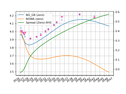
When there is not enough information to really define a proper Curve one must go looking for some extra information to steer the process. Norwegian bonds are very closely related to NOWA rates. And that Curve can be calibrated, with reasonable detail, to the IRS market. This provides a proxy for the shape of any generic Norwegian rates Curve.
Data
The following are NOWA IRS rates for various tenors.
In [10]: df2
Out[10]:
   Tenor  Rate
0     1m  4.00
1     2m  4.01
2     3m  4.01
3     6m  3.98
4     9m  3.96
5     1y  3.93
6     2y  3.79
7     3y  3.74
8     4y  3.73
9     5y  3.73
10    6y  3.73
11    7y  3.74
12    8y  3.75
13    9y  3.76
14   10y  3.77
15   12y  3.76
16   15Y  3.72
17   20y  3.60
The bond data is the same as the previous tab.
In [11]: df
Out[11]:
     Maturity  Price  Coupon                         Instrument  Accrued  YTM  Risk
0  2026-03-18  99.39    0.00           <rl.Bill at 0x12c99e450>     0.00 4.01  0.16
1  2026-06-17  98.42    0.00           <rl.Bill at 0x12c99d650>     0.00 4.00  0.41
2  2026-09-16  97.47    0.00           <rl.Bill at 0x1157b5400>     0.00 3.99  0.65
3  2026-12-16  96.54    0.00           <rl.Bill at 0x112c3fc50>     0.00 3.97  0.90
4  2027-02-17  97.68    1.75  <rl.FixedRateBond at 0x148227230>     1.62 3.99  1.01
5  2028-04-26  95.92    2.00  <rl.FixedRateBond at 0x148226f90>     1.47 3.92  2.06
6  2029-09-06  92.73    1.75  <rl.FixedRateBond at 0x1482a4230>     0.65 3.94  3.16
7  2030-08-19  89.36    1.38  <rl.FixedRateBond at 0x1482a4470>     0.58 3.96  3.84
8  2031-09-17  86.31    1.25  <rl.FixedRateBond at 0x1482a4590>     0.43 4.00  4.55
9  2032-05-18  89.55    2.12  <rl.FixedRateBond at 0x1482a47d0>     1.44 4.03  5.13
10 2033-08-15  93.06    3.00  <rl.FixedRateBond at 0x1482a4a10>     1.30 4.08  6.13
11 2034-04-13  96.59    3.62  <rl.FixedRateBond at 0x1482a4950>     2.80 4.12  6.72
12 2035-06-12  96.66    3.75  <rl.FixedRateBond at 0x1482a4e90>     2.28 4.19  7.48
13 2039-05-31  94.03    3.62  <rl.FixedRateBond at 0x1482a5550>     2.32 4.22  9.68
14 2042-10-06  91.92    3.50  <rl.FixedRateBond at 0x1482a5730>     1.02 4.18 11.24
Curve and Calibration
This follows the principles for Standard Liquid RFR Curves to construct the NOWA curve.
In [12]: today = dt(2026, 1, 16)

In [13]: spot = get_calendar("osl").lag_bus_days(today, 2, False)

In [14]: t10 = today + timedelta(days=10)

In [15]: nowa = Curve(
   ....:     nodes={
   ....:         today: 1.0,
   ....:         **{add_tenor(t10, _, "F"): 1.0 for _ in df2["Tenor"]},
   ....:     },
   ....:     id="nowa",
   ....:     convention="act365f",
   ....:     calendar="osl",
   ....:     interpolation="spline",
   ....: )
   ....:
In [16]: nw_solver = Solver(
   ....:      curves=[nowa],
   ....:      instruments=[
   ....:          IRS(spot, _, spec="nok_irs", curves="nowa") for _ in df2["Tenor"]
   ....:      ],
   ....:      s=df2["Rate"],
   ....: )
   ....:
SUCCESS: `func_tol` reached after 6 iterations (levenberg_marquardt), `f_val`: 1.8654120719255747e-12, `time`: 0.0504s
Bond Spread Curve
We now define a spread Curve, which is the quantity we add to the swap Curve in order to create a bond Curve. The notion here is to assume that the spread is determinable from only a few parameters. Here we will use only 4 parameters applicable to the 1y, 2y, 7y and 20y node dates.
This setup establishes the Norwegian Bond Curve as a
CompositeCurve, effectively adding two Curves together.
First we design the spread curve as described above.
In [17]: no_gb_spread = Curve(
   ....:     id="no_gb_spread",
   ....:     convention="act365f",
   ....:     calendar="osl",
   ....:     interpolation="spline",
   ....:     nodes={
   ....:         today: 1.0,
   ....:         **{add_tenor(t10, _, "F"): 1.0 for _ in ["1y", "2y", "7y", "20y"]}
   ....:     }
   ....: )
   ....:
To produce our Norwegian government bond Curve we add the spread Curve to the base NOWA Curve.
In [18]: no_gb_curve = CompositeCurve(id="no_gb_curve", curves=[nowa, no_gb_spread])
Calibration and Solver
This calibration phase is no more difficult than previously. The NOWA curve is already
solved so will not be calibrated again. There are only four parameters that this
Solver will mutate, and those are associated with the
spread Curve, and then bond Curve is dynamically updated since it depends directly to
the spreac Curve.
In [19]: solver = Solver(
   ....:     pre_solvers=[nw_solver],             # <- The NOWA curve is contained here as a mapping: no changes
   ....:     curves=[no_gb_spread, no_gb_curve],  # <- This defines the variable curves.
   ....:     instruments=df["Instrument"],
   ....:     s=df["YTM"],
   ....: )
   ....:
SUCCESS: `conv_tol` reached after 28 iterations (levenberg_marquardt), `f_val`: 0.007243146585862596, `time`: 0.2617s
Analysis
Rateslib doesn’t naturally do dual axis charts but with a little pyplot magic the below chart can be produced, again showing the real YTMs (pink) and the calculated YTMs (blue) from the generated bond Curve.
fig, ax, rlines = no_gb_spread.plot("Z", labels=["NO_GB_SPREAD_ZERO"])
plt.close()            # <- get the `rlines` data but do not plot
fig, ax, lines = no_gb_curve.plot("Z", comparators=[nowa])
ax.scatter(df["Maturity"], df["YTM"], color="hotpink")
ax.scatter(df["Maturity"], [b.rate(solver=solver) for b in df["Instrument"]], color="royalblue", s=5)
ax2 = ax.twinx()       # <- create a RHS axis and then add the plot from above data
line, = ax2.plot(rlines1[0]._x, rlines1[0]._y, c="g")
ax.legend([lines[0], lines[1], line], ["NO_GB (zero)", "NOWA (zero)", "Spread (Zero):RHS"], loc='upper left')
plt.show()
(Source code, png, hires.png, pdf)